3. User Interface Overview
This is the appearance of the main menu of the application at start.
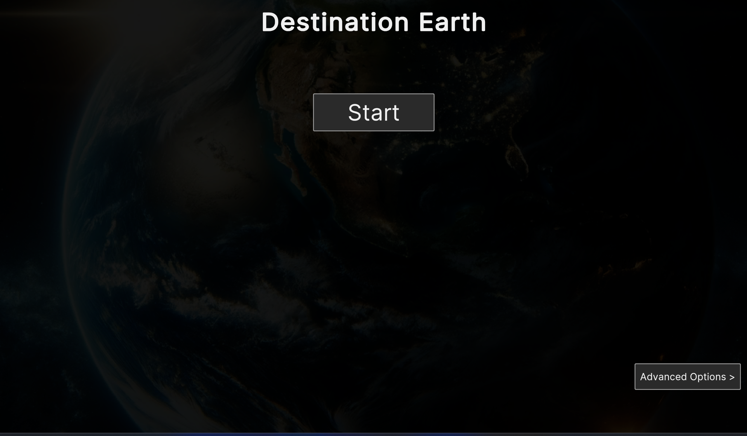
Fig. 3.1 DestinE Main Menu
User can choose to start a session directly, or go to the Advanced Options screen.
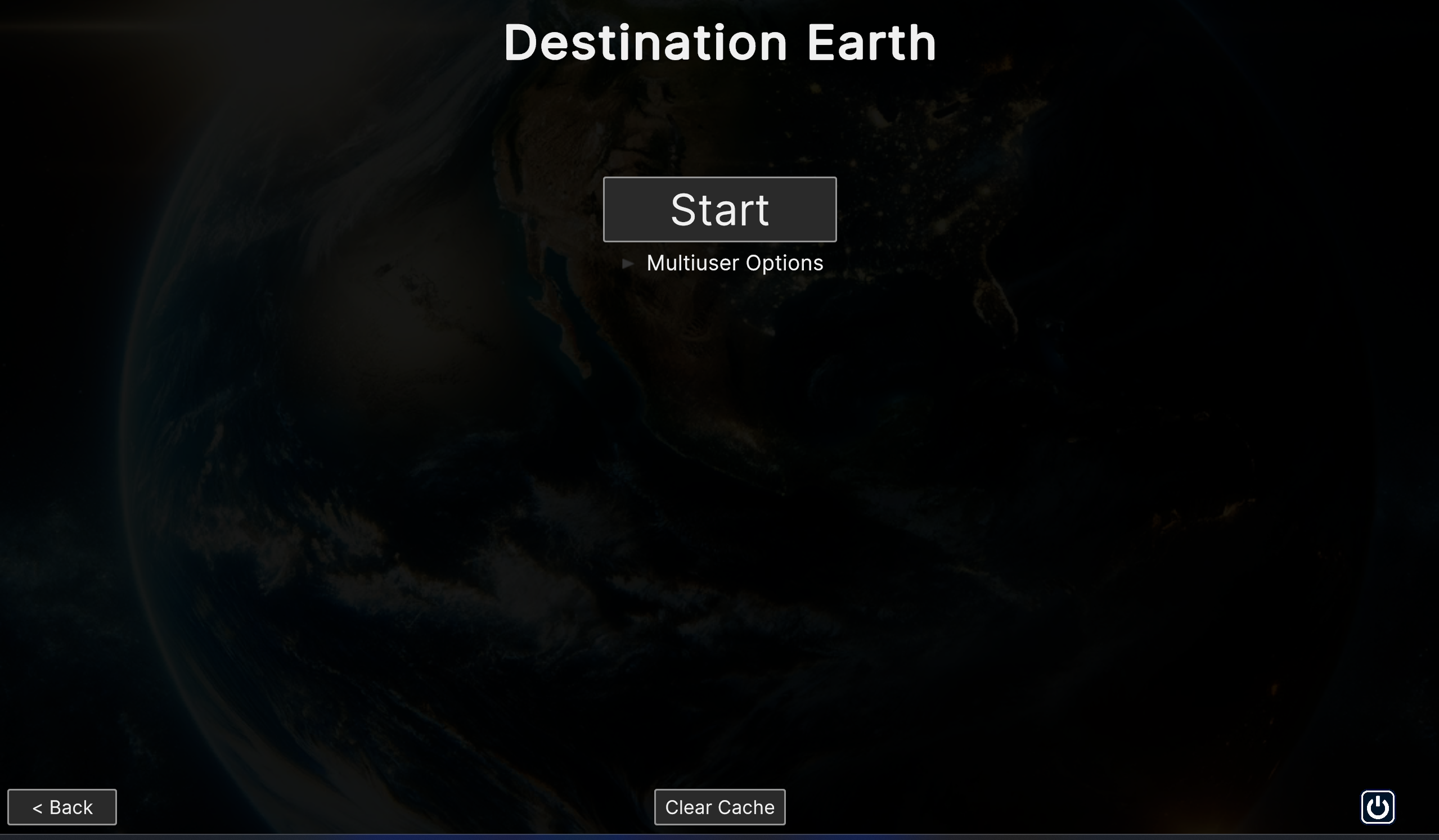
Fig. 3.2 Advanced Options with the panel collapsed
From the Advanced Options screen the application allows to go back to the main menu, or even quit the application with the specific buttons below. At the bottom center a button to clear the cache is provided. The cache contains various files from the backend, related to show or stories. When a show or a story is loaded, all the files referenced from the backend are download and stored in the temporary cache. Clearing cache deletes those files. For more information about Shows and Stories respectively, refer to chapters 6 and 7.
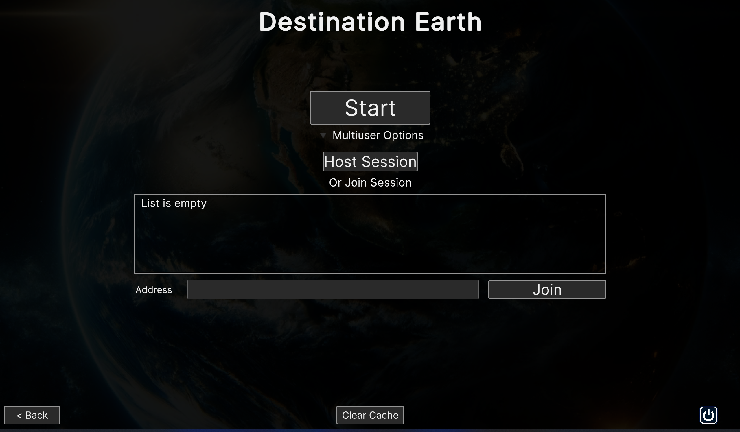
Fig. 3.3 Advanced Options with the panel expanded
The most notable options of this screen allow user to create their own session, or join an existing one. Clicking on Host Session will prompt the creation of a session accessible by other users. It’s possible to join an existing session choosing from the list of all available ones. Alternatively, user can manually type the specific IP address, providing they have one. When the application starts, if there is an existing session hosted by another user connected in the same LAN, the client automatically detects it and connects to that session after a 10 seconds countdown. If multiple host sessions are present, the first created has the highest priority.
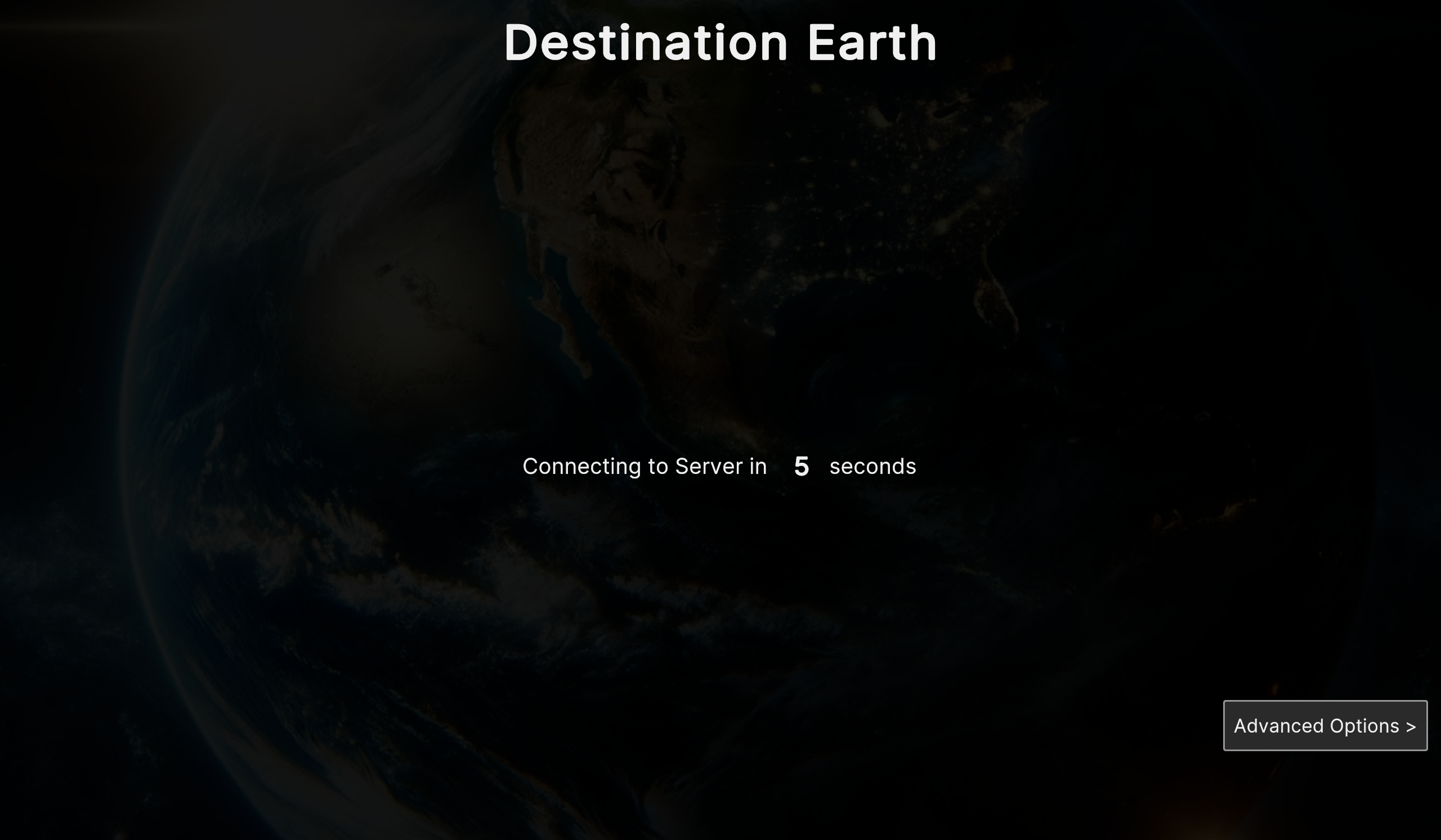
Fig. 3.4 Countdown before auto connecting to an existing host session
Once entering a session, the application switches to the screen scene, the UI at the borders of the screen and the 3D viewport on the inside, with the earth model at the center of it. Below is the default scene view in a single user session.
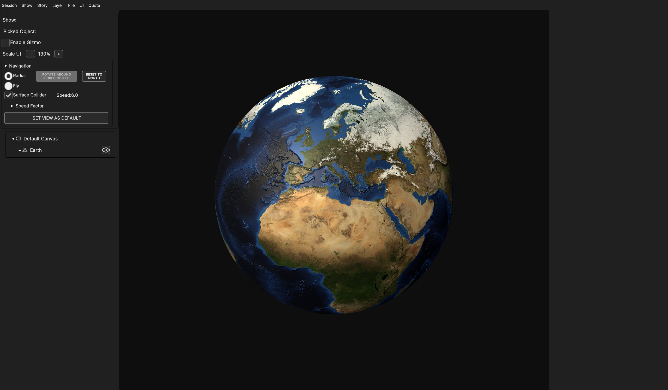
Fig. 3.5 Default 3D view at start
3.1. Multiuser session
In multi-user sessions, only one user can make modifications at a time to avoid interaction conflicts. To ensure conflict avoidance, multi-user mode provides an additional set of features, displaying scene control options at the top right of the screen, grouped together in a collapsible panel which can be collapsed or expanded through the triangle button at the top right of the UI.

Fig. 3.6 Multi user options panel in the UI scene
At the start of a new hosted session, no one has control on the scene and all the commands and UI elements that can have effect on the scene are disabled.
To take control, the use of the “Grab” button is required, which enables the whole UI, allowing user to make any modification and locking control from the other ones. No one else can grab until the control is released with the “Release” button, with the exception of the host user, who can take it in any moment, no matter if the scene edit is locked by a client.

Fig. 3.7 Multi user option panel when holding control
To avoid a user keeping the control for an indefinite time, especially in case of inactivity, it’s possible to launch a countdown with the “Timeout” button, at the end of which the scene edit is forcibly released from the current holder. Timeout countdown lasts 30 seconds.

Fig. 3.8 Multi user option panel after calling the timeout
If the holder is still active and wishes to keep editing the scene, they can reset the timeout with the button “Reset”, thus making it start from 30 again. The timeout stops and resets to 0 only upon release of the scene.

Fig. 3.9 Multi user option panel with reset enabled for the holder
3.2. In app UI
The UI is made of six sections: - Menu Bar - Tools Panel - Camera Panel - Hierarchy Panel - Inspector Panel - Timeline Panel
It’s worth to mention that the default view does not display the UI at its full use. The Hierarchy Panel can be fully explored when the scene is populated with additional layers other than the Earth, and the Inspector and Timeline panels are not immediately visible in this default view, as they become visible when a scene object is selected.
Below, an anticipation of the appearance of the UI with a fully populated scene.
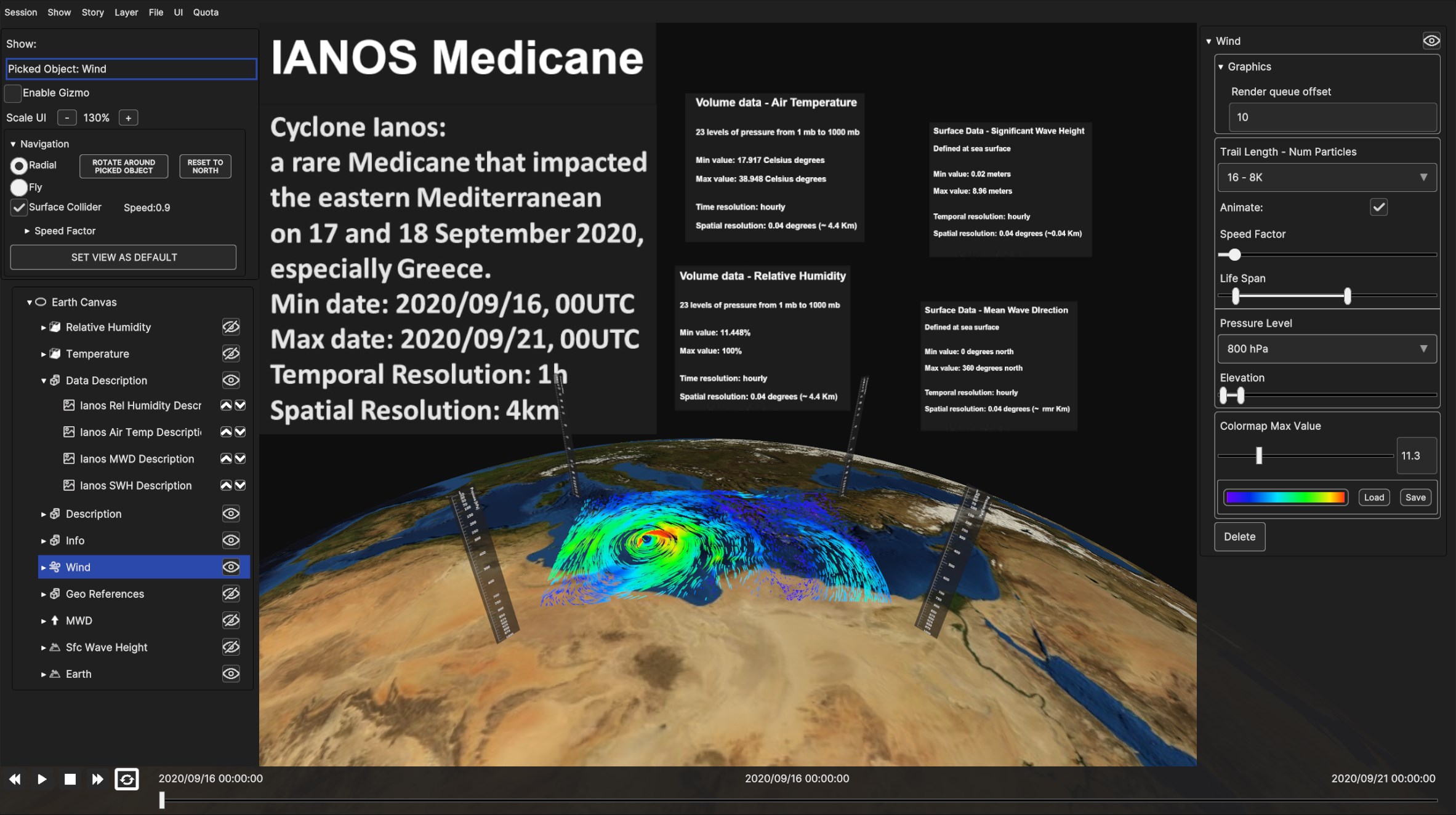
Fig. 3.10 Example of UI with a fully populated scene, with a wind rendering on the 3D Earth and the related description.
Layer UI panels, specifically Hierarchy, Inspector and Timeline panels are briefly presented in this section, since they will be explained in details in Layer Menu, chapter 3.
Menu Bar, Tools Panel, and Camera Panel will be delved into in the following sub-chapter.
3.2.1. Menu Bar
- The menu bar located at the top left of the window provides quick access to different features of the software, allowing the user to manage their work effectively. The features and their purposes are the following :
Session - To end the session or the instance of the application (chapter 5)
Show - Manage 3D scenes (chapter 6)
Story - Manage stories (chapter 7)
Layer - Manage layers, graphically representing geo phenomena on the Earth (chapter 3)
File - To download or upload files (chapter 8)
UI - To manage the visibility of UI elements (chapter 9)
Quota - To access the management of the user quota (chapter 10)

Fig. 3.11 Menu Bar
All the submenus are explored in depth in the related chapters.
3.2.2. Tools Panel
Located below the Menu Bar, at the leftmost side of the screen, the Tools Panel provides several visual options. Currently, it displays the current show name (empty if there is no loaded show), the current selected object (empty if no currently selected object) in the 3D view (“Picked Object : “), and two graphical options, Enable Gizmo checkmark and Scale UI buttons.
Enable Gizmo toggles the visibility of the bounding boxes of layers and data sources in the 3D scene, while Scale UI allows to change the size of the UI through “+” and “-” buttons.
- Keyboard shortcuts are also available to scale the UI:
CTRL + “.” Or CTRL + “+” increase UI size
CTRL + “,” or CTRL + “-” decrease UI size
The selected UI size will be retained for the next application runs.
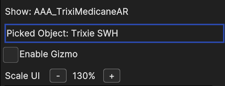
Fig. 3.12 Tools Panel
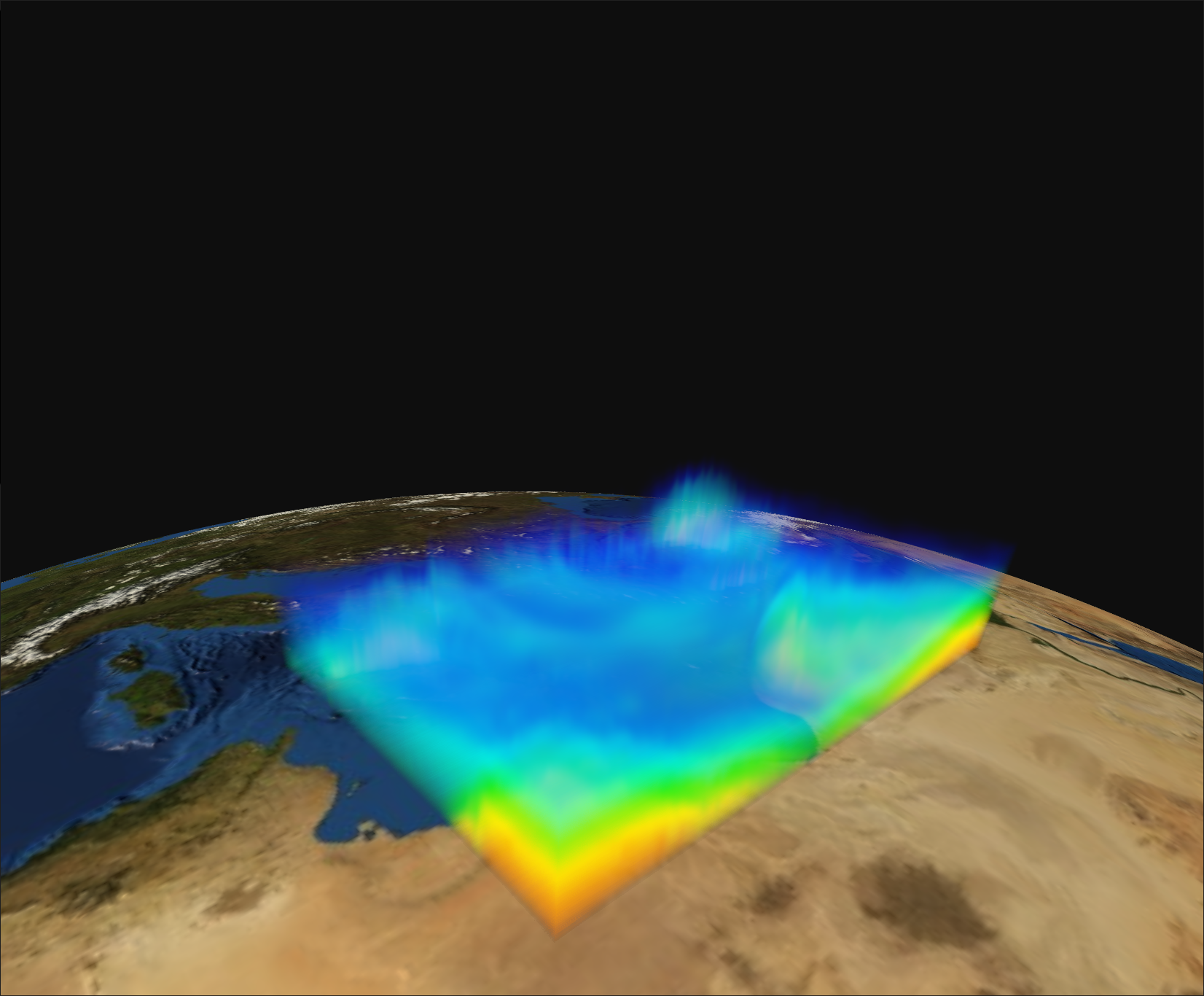
Fig. 3.13 A volume layer (temperature volumetric dataset of Ianos Medicane)
When Enable Gizmo checkbox is activated and a crop-able layer or data source is selected (either by clicking on it within the 3D scenario or by selecting it from the Hierarchy Panel), draggable handles for cropping are displayed.
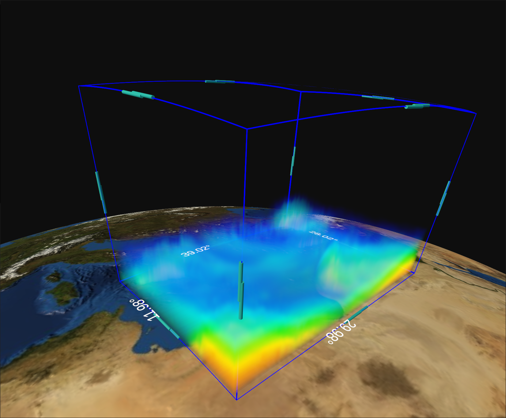
Fig. 3.14 Draggable handles of the bounding box of a volumetric dataset (Ianos Medicane)
3.2.3. Camera Panel
Below the Tools Panel is the Camera Panel, with many settings related to the camera, to help the user with the navigation in the 3D view.
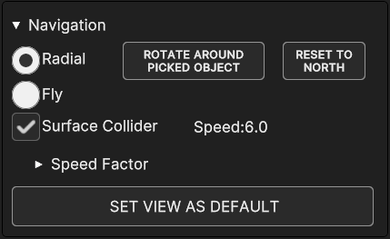
Fig. 3.15 Camera Panel
The panel is a collapsible element under the label “Navigation”, and it’s expanded by default. | User can move the camera inside the 3D scene through a Radial navigation or a Fly navigation.
- A quick overview of the options provided in this panel.
Radial and Fly radio buttons enable the respective navigation mode. With radial navigation the camera rotates around a 3D pivot point, while in fly navigation the camera movement is free.
Radial mode comes with two extra options.With ROTATE AROUND PICKED OBJECT button, the bounding sphere of the current selected object is set as rotational pivot. If no object is selected the button is disabled. By default, the Earth center is the default pivot point.
With RADIAL NORTH button, camera orientation is reset toward the North.
Notice that both buttons are disabled with fly mode on.
Surface Collider checkbox toggles the camera collision with the bounding volumes of the objects in the scene. When toggled off, camera can go forward to the pivot point without limitations. The checkbox has to be enabled when rotating around the Earth so the camera can go forward until it reaches the surface, stopping at the Earth bounding sphere.
Speed shows the current camera movement onward/backward speed.
Speed Factor collapsible panel (collapsed by default) contains three speed parameters
Move for the translation speed of the camera
Rotate for the rotation speed of the camera around an object
Tilt for the rotation speed of the camera field of view around itself
SET VIEW AS DEFAULT set the current camera position and orientation as default, so that the camera is set back to those values upon reset. Those values are stored in the show information, which means that if the show is saved, the file will keep the camera values, and those values will be restored when the show is loaded.
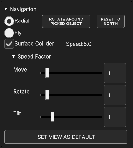
Fig. 3.16 Camera Panel with Speed Factor options expanded
3.2.3.1. Camera Controls
The camera can be controlled through keyboard and mouse controls. Commands behave differently depending on the navigation mode. Here is a list of controls for both the modes.
- Radial Navigation controls
Move On/Backward (Zoom In/Out): mouse wheel - W/S keys;
Rotate: mouse left click and drag - A/D keys - Up/Down/Right/Left Rotate arrows;
Tilt Up/Down: mouse right click and drag;
Roll Left/Right: mouse middle click and drag - J/L keys;
Reset camera position: Spacebar key.
- Fly Navigation controls
Move On/Backward: W/S keys;
Increase/Decrease move speed: mouse wheel;
Rotate Point of View: mouse left click - A/D keys;
Roll Left/Right: mouse right click - J/L keys;
Tilt Up/Down (pitch): Up/Down arrow keys;
Pan Left/Right: Left/Right arrow keys.