The Layer Menu in the Menu Bar holds particular significance within the application as it provides users with the chance to add, remove or manage Layers from the Show. Layers make visual representation of the data possible, which is, ultimately, the core feature of the application.
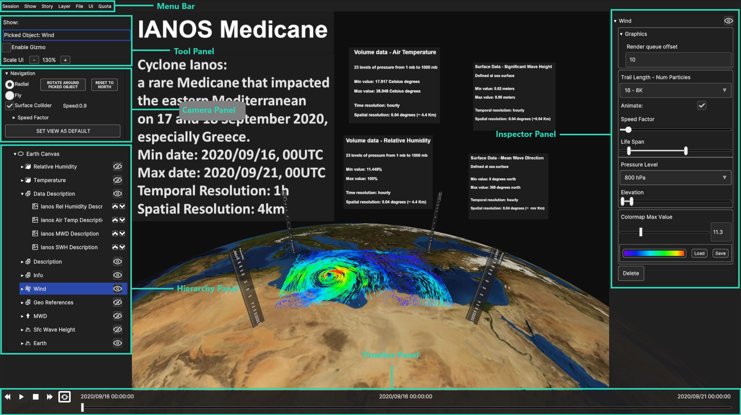
When a layer is added and selected it’s possible to fully see the UI in all of its main sections.
Fig. 4.1 UI Panels: Menu Bar (top), Tools Panel, Camera Panel, Hierarchy Panel (left), Timeline (bottom), Inspector Panel (right)
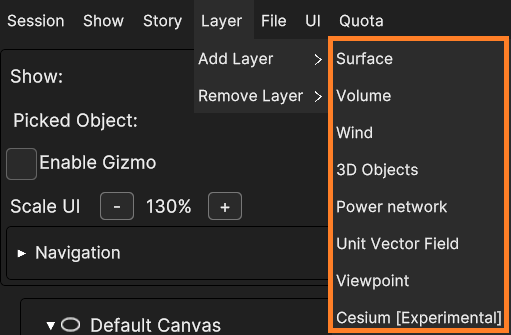
To add a Layer to the current Show click on the Add Layer option of the Layer menu: a list of all the available layer types will be shown in a sub-menu.
Fig. 4.2 List of available Layers that can be added
Here is the list of all the available Layer types:
Surface Layer
A surface Layer contains data in the form of 2D images. It is capable of blending up to five geo-referenced surface data onto a single geometry. These data can originate from various sources, including the Backend, WMS, videos, or images sourced either locally or from the internet.
See Chapter 4.2.1 for more details.
Volume Layer
A Volume Layer is designed to render geo-referenced 3D volume data sourced either from the Backend or from local device storage.
See Chapter 4.2.2 for more details.
Wind Layer
A Wind Layer features the rendering geo-referenced data either as animated particles or static streamlines. These data can be sourced from the Backend or from local storage devices.
See Chapter 4.2.3 for more details.
3D Objects Layer
A 3D Objects Layer is equipped to render geo-referenced 3D models, images, labels, and overlay images or labels.
See Chapter 4.2.4 for more details.
Power Network Layer
The Power Network Layer is capable of rendering geo-referenced histograms and charts derived from a collection of CSV (Comma-Separated Values) files stored locally on the device. These files typically contain data related to energy production and demand.
See Chapter 4.2.5 for more details.
Unit Vector Field Layer
The Unit Vector Field Layer is designed to render geo-referenced surface data sourced from the Backend. This data is represented as a field of unit vectors, where each value corresponds to the rotation angle of a unit vector relative to the North direction.
See Chapter 4.2.6 for more details.
Viewpoint Layer
The Viewpoint Layer can be populated with single points in the space to fix the camera position and rotation at a certain instant.
See Chapter 4.2.7 for more details.
Cesium Layer
The Cesium Layer is a specialized layer that makes use of Google Photorealistic 3D Tiles thanks to the Cesium framework for Unity.
Note: This is an experimental feature included in this version to showcase the continuous global-to-local view scale. Further discussions regarding commercial implementation should be conducted for production versions.
See Chapter 4.2.8 for more details.
The Geometry of a Layer is constructed depending on the type of Canvas it’s placed on (Planar or Ellipsoidal), with the exception of the Cesium Layer.
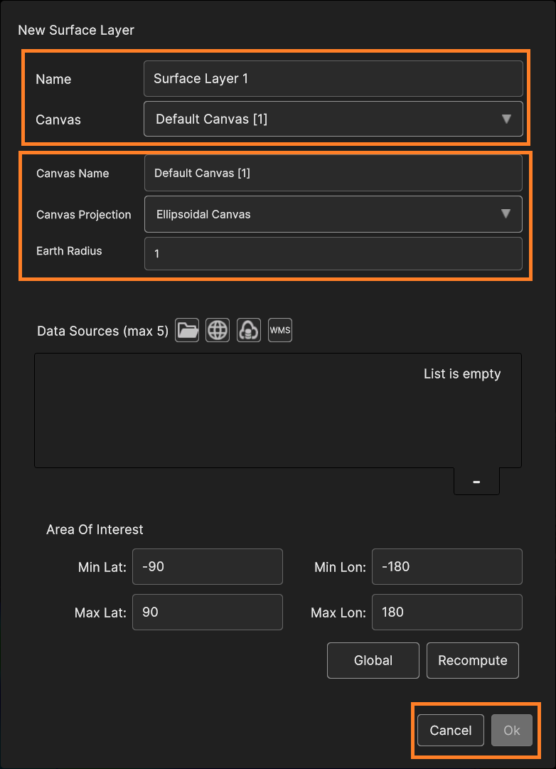
When user selects the layer type to add to the current Show, a popup window opens, allowing to choose between the available data sources to include and customize the layer parameters.
The layer-add window may vary depending the layer type, but some parameters are common for any type, including the Layer name and the Canvas to which the Layer is added.
Moreover, any layer window provides OK and Cancel buttons at the bottom right of the popup window, respectively to confirm the layer addition or to undo the operation.
The following figure illustrates those common elements available in any popup window for adding a Layer.
Fig. 4.3 Common Layer elements found in any popup window (i.e. Surface Layer)
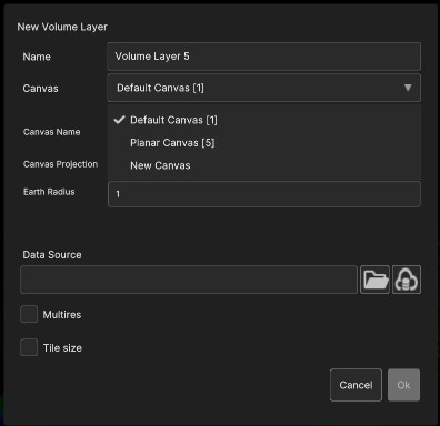
User can select the Canvas for the layer or create a new one using the Canvas dropdown menu.
More details about Canvases, Layers and Data Sources are described in Chapter 4.
Fig. 4.4 Canvas choices: user can choose to create a new Canvas or use an existing one
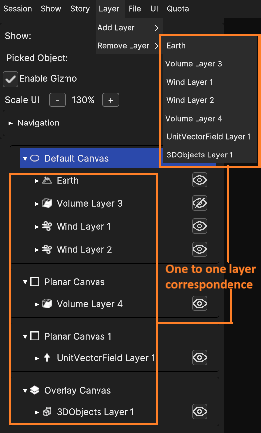
User can remove any Layer by accessing the Remove Layer sub-menu from the Layer Menu.
From there, it’s possible to select the specific Layer to remove from the provided list of all existing Layers within the current Show.
Fig. 4.5 Remove Layer sub-menu: existing Layers list matches one-to-one with the list in the Hierarchy Panel: the user can choose the one to be removed
As mentioned previously (chapter 2.2), some UI sections are fully explorable when the scene is populated with objects, layers in particular. After adding and selecting layers, it’s possible to see the effects on the hierarchy, inspector and timeline panels. This paragraph covers more in detail the feature that can be found in this UI.
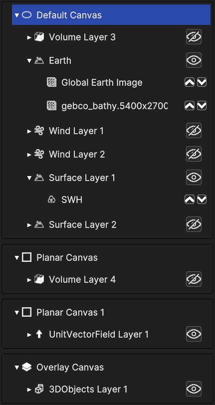
The Hierarchy Panel provides a visual representation of the composition of the 3D scene, displaying nested trees of Canvases, Layers, and Data Sources.
A Canvas may contain multiple Layers, while each Layer may consist of several Data Sources.
It’s designed to show the user a clear overview of the different elements and how they are organized. Each item in the hierarchy is represented with an icon that indicates its type (e.g., camera, overlay, object layer).
An item containing objects displays an arrow on the left side to expand or collapse its nested hierarchy. Expanding a canvas item reveals the nested layers in it, and expanding a layer item reveals the nested data sources in it.
Layers expose an eye icon on the right to toggle their visibility in the scene. Some types of data source display directional arrows to change the rendering order of the data sources inside the layer. Clicking on an arrow will push the data source up or down, and swap the position with the adjacent one, provided it’s not the first or the last of the list. In that case the item simply keeps its position.
Selecting an item highlights it and displays related information in the Inspector Panel. User can see how selecting different object types have different effects on this panel, as explained in the following paragraph.
The Inspector Panel is a notable tool within the application that allows user to view and edit the properties of the currently selected element in the Hierarchy Panel.
Each property can be adjusted to affect the behaviour and appearance of the object. Changes made in the Inspector panel are reflected in real-time in the application’s main scene.
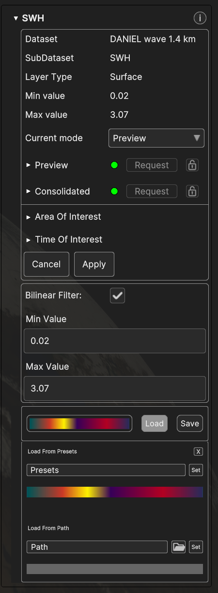
Fig. 4.7 Inspector Panel UI example (Daniel SWH data source)
This panel displays information of any kind of 3D object in the scene, whether it’s a canvas, a layer or a data source.
Each object type holds different properties, so the information visible in the inspector may vary according to the object selected. Moreover, different layers and data sources display different information on the inspector.
In this section we will showcase the recurring components of this panel, while the specific features of each layer and data source type, and their effect on the inspector panel, will be covered in detail in chapter 4.
The inspector panel it’s a collapsible element, where the information is labelled with the name of the selected object. Those are the most common information visible in the panel for each object type :
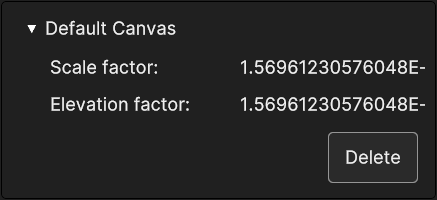
Canvases hold little information, consisting in the scale and elevation factors, and it’s the same for each canvas type. A canvas can be deleted with the Delete button below those two values.
Fig. 4.8 Inspector panel for a canvas (Default Canvas)
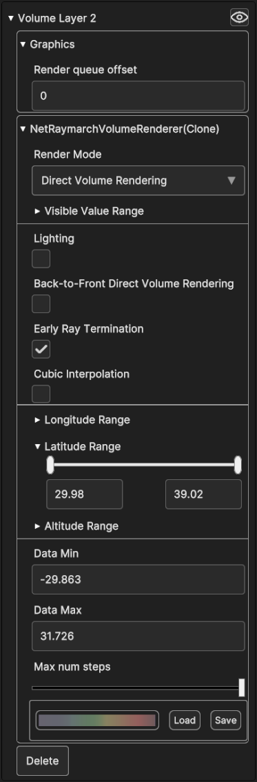
Layers store several information and settings, and often includes a section with graphic settings, a section with geographical settings to change the longitude, latitude and altitude limit to cap when rendering. On the top right corner their inspector shows the same eye icon in the hierarchy panel, which works in the same way. As canvas inspector, they provide a “Delete” button down the data.
Layer inspector may include a specific UI element designed to change the color map of the 3D representation of the data, the Colormap Picker, to be showcased in chapter 3.2.2.1.
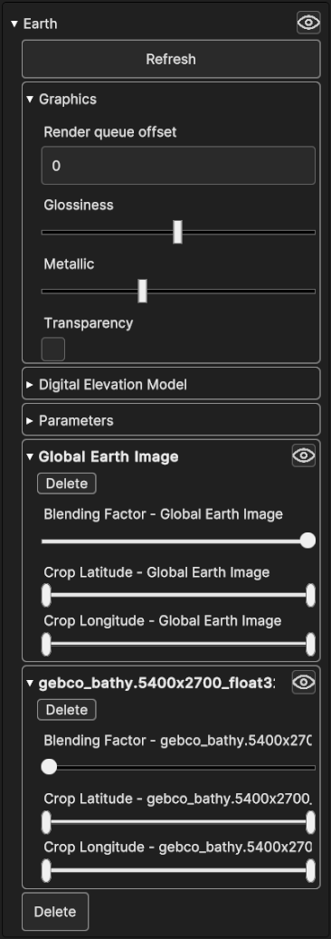
If a layer holds multiple data sources, colormap picker is usually absent because each data source can have its own colormap, therefore the colormap picker is inside its inspector. In this scenario, the inspector may show a small info collapsible sub-panel for each data source.
Fig. 4.9 Inspector panel of a layer, with graphics settings,
geographical setting and a colormap picker
Fig. 4.10 Inspector panel of the Earth layer with graphics and other settings,
plus sub-panels containing settings for the nested data sources
Data source sub-panels contain a few settings that can be made directly from the parent layer, including deleting the data source or hiding it with the specific buttons. It’s possible to set the geographical range by cropping the coordinates with the sliders, and set the blending factor, which affects the opacity of the rendering of the data source.
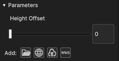
Additionally, the parameter section may contain a small menu to add a data source, which looks and works like the one found inside the add-layer pop up panel for some data types (e.g. surface).
Fig. 4.11 Parameters section with Height Offset settings and the add layer mini menu
Data sources store many other specific information as well as information related to their parent layer, plus many settings.
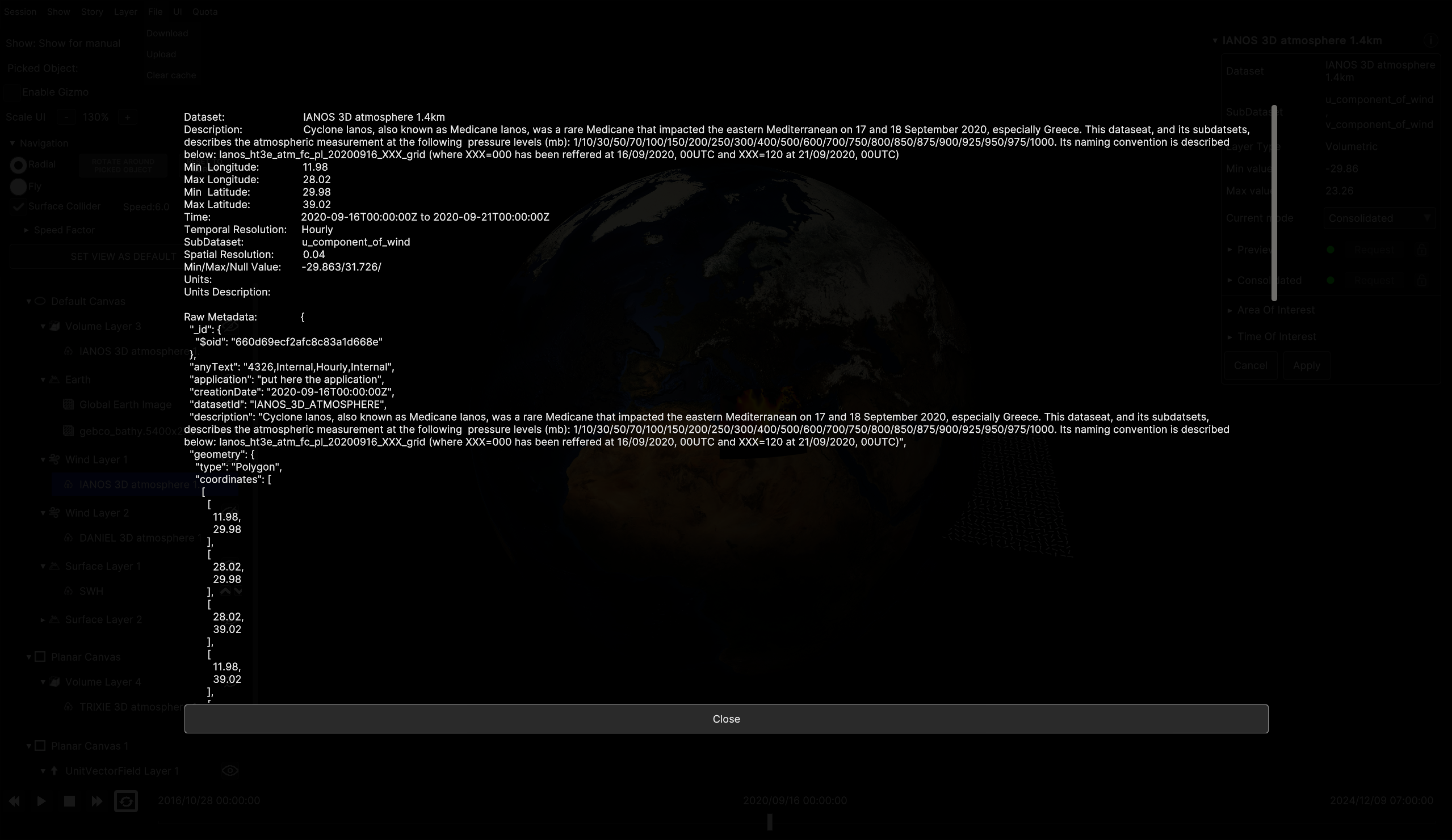
All data sources expose an info button “i” next to their collapsible label, which opens up an overlay panel containing all the textual metadata of the data source, including the raw metadata as Json text.
Fig. 4.12 Collapsed inspector panel of a data source with name and info button
Fig. 4.13 Appearance of the overlay info panel of a data source
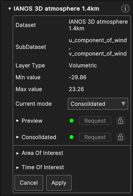
Depending on the data type, information displayed in the inspector may vary, but almost all data sources from the Backend that can be added to a scene, share the first section.
o Current mode dropdown which allows to set the mode to Preview or Consolidated
o Data Preparation Sub-panels which hold settings for the different view modes
o Area of Interest (AOI) and Time of Interest (TOI) which contain sliders to set the coordinate range and the time range.
o Cancel button to undo the changes made in AOI and TOI and reset to the previously saved ones (since changes do not occur in real time but they need to be manually applied).
o Apply button to confirm any changes made in AOI and TOI.
There is a settings panel for each of the available modes and the panel settings that take effect depends on the selected one.
There are two modes, Preview and Consolidated
o In Preview mode, data is processed to be at a fixed resolution.
o In Consolidated mode, data is processed to be available at multi-resolution levels of details, through a standard OGC WCS service.
The time required for data processing may not be immediate, as it depends on the response speed of the underlying backend infrastructure. However, once processing is complete, the data can be accessed very quickly.
Following below is a more detailed explanation of the Data Preparation Panels, the AOI and TOI.
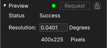
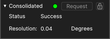
The Data Preparation Panels expose these settings and properties :
o The Request button to send a processing request for that data source.
o The Lock Button marked by the locked icon to lock or unlock a data source. When user lock a source, it prevents from being deleted by the back-end server, and they are the only ones that can delete or unlock it.
o The Status Label returning the request result, which take effect on the led icon next to the request button. The status result can be
■ Success with the Green icon
■ Pending with the Yellow icon
■ Failed or Unavailable with Red icon
o The Degree Resolution, it’s a Label for the Consolidated mode, or can be edited for the Preview mode
o The Pixel Resolution available for Preview mode only
Fig. 4.15 Data preparation expanded for Preview mode
Fig. 4.16 Data preparation expanded for Consolidated mode
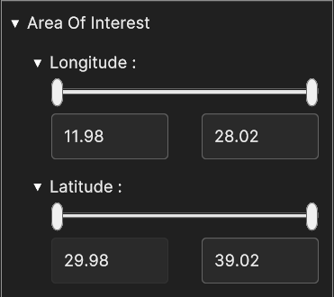
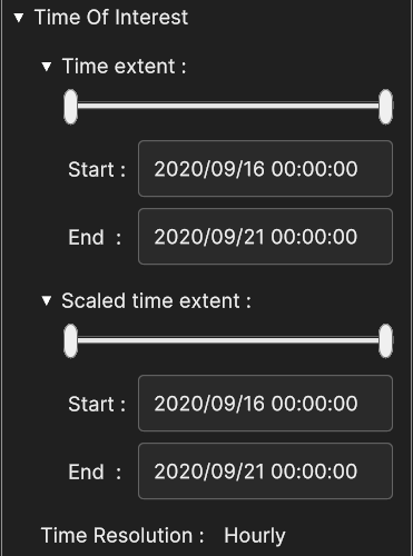
Area of Interest is a pair of filters with the purpose of selecting the desired geographical area of the data to display. The filters can be set through the Longitude and the Latitude sliders.
Beside setting the value with the handle drag, these sliders are equipped with text boxes to manually type the values. When the changes are applied, the bounding box of the dataset is cropped according to the values.
Notice that the area can be reduced but not increased from the original extension of the dataset, as the sliders range corresponds to the original extension of that dataset.
Area Of Interest can be edited only for data sources attached to a surface layer.
Time Of Interest is a pair of filters the serves to select the desired time range of the dataset to preview. The filters can be set with the Time Extent and Scaled Time Extent sliders, whose ranging values are in the form of timestamps. Additionally, TOI includes the Time Resolution property which indicates the interval length between each recorded state in the data source. For instance, if the time resolution is hourly, the data source includes data for each hour over the covered period.
Time Extent sets the selected time range for that data source and Scaled Time Extent fits the selected Time Range inside the selected scaled range. The selected time intervals are aligned with the Time Resolution.
Like the AOI sliders, they have an additional textbox to set the timestamps manually (provided they are in the correct format and inside the time range). When changes are applied, the Timeline Panel changes its time range accordingly, constraining visualization of the data source through that time span.
Note that the time range can be reduced but not increased from the original time span of the data source, as the slider range corresponds to the original time span of that dataset.
Time Extent can be edited only for data sources attached to a surface layers.
Please note that whenever the user applies changes to the AOI and TOI, a new data preparation request is sent to the Backend.
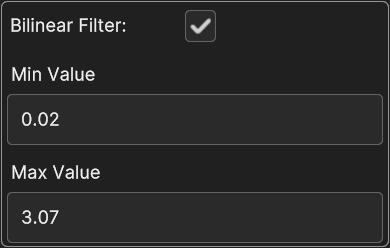
Data sources from the Backend that are attached to a Surface Layer, provide another section to enable o disable the bilinear filter, and to override the original minimum and maximum value of the data in order to apply the current colormap in a different range of values.
Fig. 4.19 Bilinear Filter, Min Value and Max Value
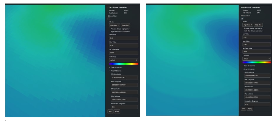
An example of the effect of the bilinear filter is provided below.
Fig. 4.20 Bilinear Filter off (left) and on (right)
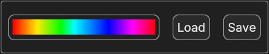
Another notable element that may be found in the layer inspector is the Colormap Picker, which is explored in depth in the following paragraphs.
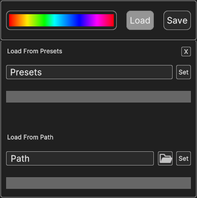
Colormap Picker provides a convenient way for the user to change the colors of the 3D rendering of the data. It contains the currently selected colormap preview and two buttons, Load and Save.
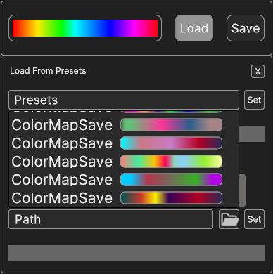
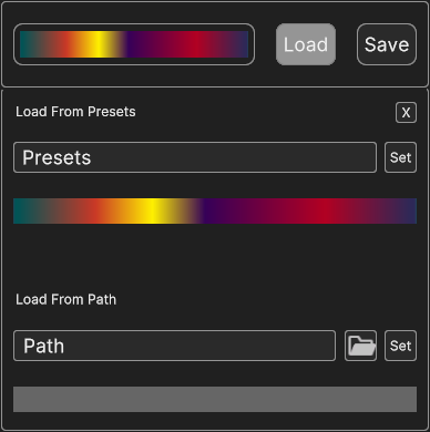
o The presets dropdown allows to select among the existing colormaps stored in the application. The set button on its side confirms the selection, setting the newly selected colormap as current one, changing the colormap of the 3D data in the scene.
o The folder button at the side of the Path label offers another way of choosing the colormap by browsing files locally stored in the device. In the same way of the presets, the set button on the label side confirms the selection and sets the new colormap both in the picker and in the data source inside the scene. The path of the selected colormaps is visible in the path text box.
Fig. 4.25 Colormap picker after confirming browsing selection
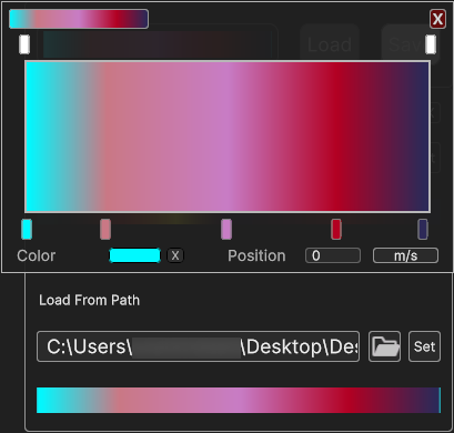
If user is not satisfied with the available colormaps, they can customize their own one. The colormap preview is not a merely visual element, but a clickable area as well. Clicking on it opens up a nested overlay widget, the Gradient Picker, which provides an effective way to customize the gradient for a colormap by setting color keys and alpha keys. This is covered in the next paragraph.
Fig. 4.26 Colormap picker with overlay opened Gradient picker
Trough the save button the current colormap can saved in a local directory to be available for future uses.
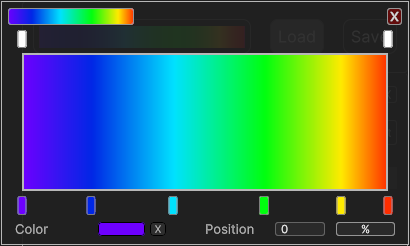
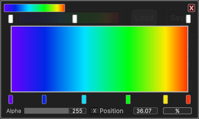
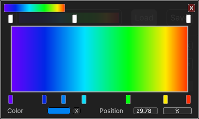
Gradient Picker is a nested component inside the Colormap Picker. It’s equipped with two multi-sliders designed to change the color keys and the alpha keys (transparency) of a gradient, through the draggable handles. Here is the comprehensive list of its parts.
One of the most convenient features of this element is that transparency and color transition can be changed separately, using the respective multi-slider. Each handle corresponds to an actual gradient key with the same position and value. This 1 : 1 correspondence allow to preserve consistency between the visual representation of the handle and the actual gradient properties. Gradient Picker automatically blends the color or the transparency of adjacent handles, making a smooth transition resulting in the gradient effect.
An overview of the Gradient Picker features.
Between the two sliders, the current gradient preview visually renders the current state of the gradient. On the top left of the window another small box holds the original appearance of the gradient before modifications, for comparison.
The alpha slider and color slider allow to change, respectively, the order of the existing alpha handles and color handles.
Both sliders behave in the same way, with the only difference that alpha handles are colored in gray scale, depending on the relative alpha value, while color handles are colored according to the relative color value.
Clicking on a handle triggers its selection and its properties are shown in the bottom section.
Dragging the handle along the slider changes its position and the relative key accordingly.
It’s possible to add a new handle by clicking on an empty area of a slider, resulting in the creation of a new key with the same position and the value set as the value of the gradient in that position.
Fig. 4.28 Gradient Picker after adding alpha handle
Fig. 4.29 Gradient Picker after adding color handle
The bottom area holds the properties of the currently selected handle. It shows the alpha value or the color value of the currently selected key on the left, and its position inside the gradient on the right.
o The position value is displayed in the textbox next to the “Position” label. When the handle is manually dragged this value is updated in real time, and vice versa, typing the desired value in the textbox updates the position of the handle inside the slider.
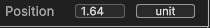
o Position can be expressed as a relative value, ranging from 0% to 100% or the absolute value ranging from the minimum value to the maximum value of the dataset related to the gradient. It’s possible to switch between the two modes with the unit button on the rightmost part of this section. The button is marked with the “%” symbol or the specific unit of measurement basing on the toggled mode.
o Next to the color or alpha value, the “x” button provides a way to remove the currently selected handle. The gradient is recalculated according to the change.
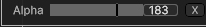
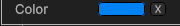
o The left side of this section allow to change the actual value of the handle. In case of an alpha handle, it provides a slider and textbox to change the transparency value of the handle, between 0 and 255. In case of a color handle, a small box shows the preview of its color.
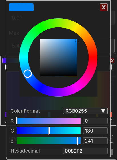
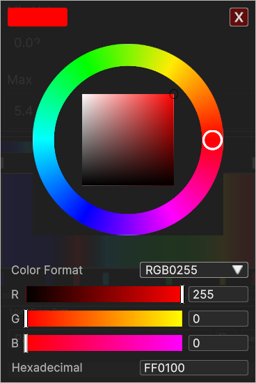
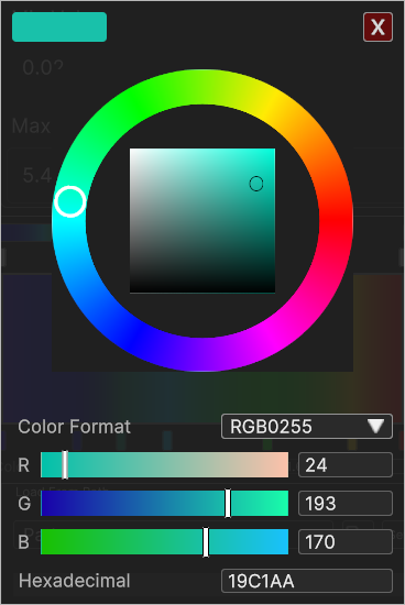
There is another nested element inside the Gradient Picker, as clicking on the color box opens up another UI component to change the color of the handle: the Color Picker.
Fig. 4.35 Gradient Picker with overlay opened Color Picker
At the top left the box with the color preview is visible. On the right the “X” button to close the color picker window.
The central area of the Color Picker is allocated to the wheel slider, designed to change only the hue of the color. By dragging the handle along the circular ring user can choose the tone of the color without affecting brightness and saturation.
The 2D square slider inside the wheel provides an intuitive way to adjust brightness and saturation of the color, ranging from black to white on one side (brightness), and from white to the full color on the other side (saturation).
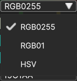
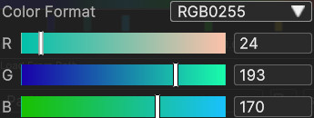
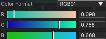
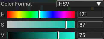
Following below, the color format dropdown paired with the channel sliders help to change the color focusing on a single channel. Format dropdown allows to choose between three different color formats.
o RGB 0-255 to display the color in its red, green, blue channels, with integer values 0-255
o RGB 0-1 to display the color in its red, green, blue channels with decimal values 0-1
o HSV to display the color in its hue, saturation, value channels, ranging from 0 to 360 for the hue, and 0 to 100 for saturation and value. Notice that hue range is defined as 0-360 to match the 0-360 degrees range of the angle created by the handle on the color wheel.
Changing the selected format have effect on the appearance of the sliders, which will be set up to change the channels corresponding to the format and the value ranges. Slider are paired with a textbox to set the desired value with precision.
The wheel and 2D slider, the channel sliders and the hexadecimal textbox provide three different ways to represent the same color and they are interdependent, meaning that interacting with one element trigger the update of the other ones, so they match the same color without discrepancy.
The Timeline Panel is a time navigation tool that enables users to view and interact with data over a specified time range. It’s designed to give control over the temporal analysis of data within the application.
Play and Pause Buttons allow the user to start and stop the time progression, and the Speed Up/Down buttons (when available) allow to increase or decrease the animation speed. This can be useful for playing through events or pausing at specific moments for a detailed analysis.
Right above the time bar are three timestamp labels, respectively on the left, in the middle and on the right. These indicate the start time, the currently selected time, and the end time of the visible time range. For example, the timestamps 2023/09/04 00:00:00 mark the beginning, 2023/09/04 00:00:00 in the center indicates the current time, and 2023/09/07 00:00:00 indicates the end of the time range.
The horizontal bar represents the progression of time. User can click and drag the slider or click on a specific point along the bar to jump to different times or dates.
It’s worth to mention that not every layer can be animated, especially the ones that make use of multi-resolution data, since it’s practically impossible to have a smooth animation in that context.
Animation for volumetric data requires a preliminary buffering, so it may take a while before animation gets smooth. Currently this is not available for the XR version, due to the limited hardware capabilities of the headset devices.
Animation runs fairly smoothly when using georeferenced videos or fixed-resolution surface data from the backend as the data source for surface layers, as well as with unit vector fields.